A well-designed visualization can effectively communicate complex information, engage the audience, support decision-making, and provide an excellent user experience, thereby maximising the impact of the data being presented.
Design principles are crucial in any context because they provide a foundational framework for creating effective journeys and helping to make choices that enhance the overall user experience and communication.
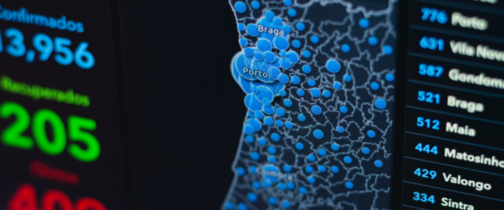
Effective data visualization relies on 12 key design principles that help convey information accurately and efficiently. Here you will find
1. Clarity
The visualization should be clear and easily understood by the intended audience.
2. Simplicity
Keep the visualization simple and avoid unnecessary complexity.
3. Purposeful
Understand what message or insight you want to communicate and design for that purpose.
4. Consistency
Maintain consistency in the design elements throughout the visualization.
5. Contextualization
Provide context for the data being presented.
6. Accuracy
Ensure the visualization accurately represents the underlying data.
7. Visuals Encoding
Choose appropriate visual encodings for the data types you are visualizing.
8. Intuitiveness
Design the visualization to be intuitive and easy to comprehend.
9. Interactivity
Consider adding interactive elements to the visualization, such as tooltips, zooming, filtering, or highlighting.
10. Aesthetics
Although aesthetics are subjective, a visually appealing design can engage viewers and increase their interest in the data.
11. Accessibility
Accessibility is key; if users can’t read the data, it’s useless.
12. Hierarchy
Work out hierarchy of information early on and always remind yourself of what the purpose of representing the data is.
Ultimately, design principles play a pivotal role in streamlining the design process, a facet of their significance that extends far beyond the realms of aesthetics. By adhering to these principles, designers and creators can ensure that their work is not only visually pleasing but also thoughtful, impactful, and harmonious for the end user.
Related data visualization work: Cybersecurity, Travel & Hospitality, Financial Services
Share this Blog with colleagues